Erik Kessels installation art: a day of photos uploaded:
The visual web is on a roll That momentum brings a new set of challenges for the digital, tech and social savvy business. If listening, engaging and connecting in a largely text based environment was a challenge for many businesses, imagine the challenge posed by imagery with text and/or imagery alone. How does a business listen to images? How does a business engage with the images others are creating of them? There are some emerging technologies and stories I am learning about. More of that another time.
But lets start by imagining a world where once again democratization changes the “power” relationship of things…and customers get to take control of things traditionally owned or dominated by business. Lets looks at visuals and imagery.
When you think about it, much of the imagery we have traditionally been exposed to was either family oriented (largely private), journalistic or distributed by business. As I look back, the daily image bank largely consisted of:
- Family memories (those photo albums and shoeboxes or home made videos or Kodak slide carousels);
- World events – The Journalistic Impression: the landing on the moon, the Vietnam war, the President being sworn in, the Berlin Wall falls. These iconic photos from major events that we saw in our newspapers, magazines or on television.
- The Marketing images that surround our daily lives — The imagery we saw tended to be either controlled by the brand and flooded into our living rooms, jumping off the pages of magazines we read…surrounding our lives in the fridge, pantry, on buses, billboards and in stores or wherever we looked. These images, often suggestive, interruptive, slick and beautiful by design. Occasionally the images were instructive diagrams for products we used
- The Images we Used to Decorate or make statement: The poster on the wall of your room or dorm room, the images you chose to help decorate a home, including visuals that were part of story books we cherished or books of images from places or events that meant something special to us.
- Art Images: the images of Art that we might enjoy in galleries or at historical displays or landmarks
Based on this inventory, businesses images and the business of imagery for business has traditionally held a pretty predominant position in our visual world.
Just as the Web, and especially the social Web, changed how brands had to think about themselves, business is on the cusp of having to rethink visual communications, the creation and control of imagery related to brands. Everything changes when anyone with a camera in his/her pocket can take a photo of anything they want and share it. Those images are imbued with new meaning. Meaning constructed by the individual, shared with friends and family — how do businesses respond? How do brands as publishers react? Or connect with relevant audiences who are forming their own narrative around images? And, as the Web becomes awash in imagery (think Buzzfeed and all the new online news sources and how they use imagery in powerful ways) what new sets of issues arise for marketers and their business related to imagery and visual communications? Im thinking this goes beyond just, “lets make out content marketing more visual.”
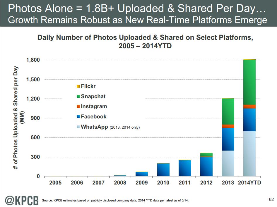
The Imagery/ Visual Tidal Wave: Since the previous post, Mary Meeker’s annual presentation on Internet trends has become available and her estimates are an amazing 1.8 Billion photos uploaded and shared everyday – and that chart is missing Google+ which has an extremely active photo community(several 100 different communities with thousands and thousands of members); it also does not include the specialist photo community such as Adobe’s Behance community (follow the link to see live the number of photos being uploaded while your browser is there). And by the way, look at not only the magnitude here, but the growth, much of it in just the last couple years — so are we just the beginning of this tidal wave of imagery? What does this look like next year and couple years out?
Sites like Pinterest, Tumblr, Instagram and Vine are not only experiencing tremendous growth, they are also attracting the youngest, hippest audiences that marketers always gravitate towards. Snapchat reports 246,000 images and videos per second, followed by Facebook reporting about 246,000 images and videos per second. More than 100 hours of video are uploaded to Youtube every minute. The top 3 mobile apps by growth in 2013 were all visual: Vine, Flickr and Instagram. (Source: Digiday)
Thoughts from Demand14: Thanks to Geoff Livingston questions at the Demand14 panel on Content Boom, and reflected in several of his blog posts, here are a few more thoughts about the visual Web that we started to discuss (and ones I continue to explore to bring together a more fully formed visual framework that can help us have a well formed context for discussions that are more fully grounded than simply: “lets make it more visual”;or “lets add a fun buzzfeed like GIF.”
- Stone age regression? In the old days of social media we talked about “Conversations” and that was often equated to the global village using tech to have an old style chat down at the country general store. Today we talk about visual communication — and when you think about that, visual communications predates conversations and language. It really is equivalent to cave drawings as a form of communication. So does this mean that we just continue to regress to our most base instincts in all of this? Or does it simply reflect the power and staying power of the visual image? Images are with us forever: During 20,000 years from the Paleolithic drawings of the Lascaux Cave in France to the disappearing image on Snapchat we express ourselves through images?
- Visual Leads and yet is also Behind: While mobility, the apps and social networking sites are becoming more visually immersive, other technology categories remain behind. For example, search is mostly text based. Most search and photo categorization depends on GPS or tagging…..and on tagging, buried in the Mary Meeker data is this little fact: “that a very Small Portion (7%) Data = Tagged” (source page 85). This has tremendous ramifications for finding, tracking, understanding and classifying “visuals”…so does software (still emerging)
- Universal Language meaning different things to different people: In some respects photography is a universal language – it breaks beyond the barriers of languages. But it also is more complicated because visuals also lack precision – a single image can mean different things to different people, depending on the context and what they associate with the image. That gets complicated
- Images determine what you buy, who you vote for, even who you want and want to have sex with: We also know that the image can be flexible and useful for creating dialogue. But images can go beyond dialogies. As Heiferman notes: images can be determinative: An image can make people want to buy XXXX; have a nice cold beer; eat YYYY; vote for good looking John F Kennedy over shady Richard Nixon; and they even help determine who you want and when you want to have sex.
- The image is multifacted: the fact remains people use images in all kinds of ways to communicate all kinds of things – and some of it is cool and bleeding edge. Instagram proves that. Some of it is exploitative too
- Often Photos are thought of as slices of a moment in the past — sunsets, meetings with friends, the family vacation — but is this rapidly changing such that photos are less about memories of our past and rather they become an entirely new type of dialogue. The cutting-edge crowd is learning that communicating with a simple image, be it a picture of what’s for dinner or a street sign that slyly indicates to a friend, “Hey, I’m waiting for you,” is easier than bothering with words, even in a world of hyper-abbreviated Twitter posts and texts. It is a watershed time, where we are moving away from photography as a way of recording and storing a past to using photography as a way to communicate directly
How does Business adopt: At Demand14 Geoff also asked: How can a company adapt, and create more visual content? And how important is visual presentation in differentiating content; design, making sure Twitter cards are set up, featured images, etc. Some thoughts included:
- The visual eye: A business adopts that same way a photographer like Geoff has been doing recently…. Go play with the camera and “work it” until you expose the pictures you want. A photo artist once told me it is like hunting, you go around and around and around looking for the prey….and then you shoot.
- But once you start to develop that visual “eye” and have the practice of going around and around looking for the prey, you still have to put your brain back to work to integrate that visual into how you tell and share your stories.
- Combining the visual raw material into a “narrative” – now that takes work. Making it a stand alone narrative o story is even harder.
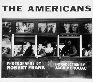 What Might be Learned from one of the finest Visual Stand Alone Narratives of our time: My reference point for that was the now highly regarded (originally dismissed) book by Robert Frank, The American’s released in the late 1950s. I think if we want to talk about visual story telling this iconic book/photo project has a couple lessons for business thinking about adoption to the visual Web and an era when visuals form their own language, beyond simply the Web.
- Robert Frank shot 767 rolls of film yielding about 27,000 images on 24 months road trip across hat took him across and around the United States (in several phases).
- He edited 27000 images down to about 1,000 work prints, spread them across the floor of his studio and tacked them to the walls for a final edit.
- Frank chose just 83 images from a year a half of work… a picture for every 9 days of his trip. Or in other words/converted to a ratio, 0.3% of his pictures made the final cut.
- He also spent about a year or two editing and sequencing the images to complete the book (first published in French in 1958, the American edition finally was published in 1959 originally to much dismissive commentary…only later to become a classic).
- Some have said of the Frank brilliance that “form and content become interdependent, and meaning was established as much by the movement between the photographs as by the photographs themselves.”
- Frank also said it was important that he didn’t have to explain everything to the viewer directly
- Herein lies another fundamental challenge for business adopting visual as narrative or as language: True visual communications will have elements of sequencing, rhythm, but ultimately things are left to the onlooker. The “audience” must have something to see. It is not all said for him/her in a photograph as different images and lights have different meanings to you and me. Robert Frank likened it to poetry: “[I want my viewers to] feel the way they do when they want to read a line of a poem twice”. Learn more about this iconic project: http://www.nga.gov/exhibitions/frankinfo.shtm or learn more about Robert Frank here https://www.artsy.net/artist/robert-frank (added at the request of artsy.net, June 2015)
Where does this leave us….with more to think about, I suppose. Digital photography, camera phones and the Web short cut the development, printing and distribution costs. They also democratize how images are created used and open up new concepts of visual communications and brand commentary. More on that later too from some early MIT studies I have been learning about.
Visual as Supportive or Their Own Language: The evolutions also lead us to recognize that the visual form of communications can take two directions. Each very powerful in its own right…but also each requiring improved visual literacy and strategies for business. One is that the visual or image can be an integrated aspect of narrative or storytelling, brand building. Combining visuals with text there is a means to form a stronger more appealing and deliberate narrative.
However, equally important is the emergence of visual communications where, in fact, the visual/image is its own language. That language is rich, textured, nuanced and can be directional but also highly interpretative and open to “mis-interpretation”. Perhaps therein lies the uniqueness and challenge for new and more visual use in marketing: who wants to leave it to the audience to simply imagine? And, yet the more pedantic we become with the image to “make the meaning we want it to make” does the image itself then lose power?
I don’t know the answers. But seems to me we ought to open a dialogue and thinking about these kinds of implications? I share these because I said I would. Also because I have been a little quiet as I deep dive through the research on visual perception and how the brain process visuals — differently for different people. Ive also been buried in several reference sources on photography and its fundamental power or how a picture is worth a 1000 words….its a just a question of which 1000 words and whether you and I see that the same way.
More to come….Your thoughts?????
PS: For fun related to the last post: About the Images:
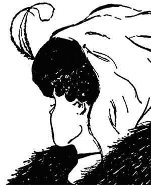 Young Woman/Old Woman: “With the old/young women, two persons can be perceived, an old woman and a young woman. When the old woman is figural, all the rest of the picture is ground; when the young woman is figural the old woman disappears into the ground. As you study the picture you may be able to change your perceptions from one figure to the other in order to appreciate the process of emerging figures and receding grounds.
Gestalt figure/ground theory states that the arbitrary change of perception of a figure emerging from the ground has to do with our unconscious mind. It’s influenced by our experiences, values, beliefs; our complex internal world that is usually out of our awareness, but guides us in many ways. So, the theory is that if at the first look you perceive the young woman before the old lady, this may relate to personal experiences with young women that “stand out” compared to your experience with old women. Whether you notice the old or the young is related to your rich and varied unconscious mind from which many of our important beliefs and feelings stem.
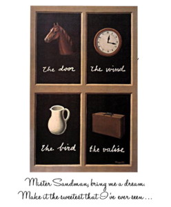 Magritte’s The Key of Dreams: “The Key of Dreams, the artist successfully attempts to demonstrate that “seeing comes before words,” and that there is a gap between words and what we see since we cannot explain what we see exactly. What we see and how we see it is reflected through our individual experiences and how we relate to what we are looking at. In the painting there are four panels, each in which Magritte has placed an image above words. In the first panel we see an image of a horse with “the door” written underneath. The panel to the right of this depicts a clock with the words, “the wind.” The panel underneath this one shows a suitcase with “the valise” written. And finally, the panel to the right of this depicts a pitcher accompanied by the words, “the bird.” It is interesting how Magritte has placed an image of something that is recognizable, and paired it with words that describe something else that is recognizable. However, since we are not actually seeing it, only the words that describe it, in our minds we can imagine what color that door is, or what kind of bird is being referred to.
When looking at the image of the horse in the first panel of The Key of Dreams, the viewer would automatically recognize what it is. However, Magritte has paired this image with “the door,” which is completely unrelated. By doing this, Magritte has emphasized the point that seeing comes before words, since it is more likely that the viewer would look at the image before reading the words. By using words that do not describe the image, he has made an exaggerated point that there is a gap between words and what we see. Upon seeing the image of the horse, the viewer would probably think, “horse” or perhaps of a memory that relates to it. After reading “the door,” the viewer is thrown because it is more than likely that their initial thoughts had nothing to do with a door. When they saw the horse they did not think, “this is not a door.” What they thought was, “this is a horse” and what it relates to in their mind, not what it isn’t or doesn’t relate to. In the end, the image remains true and it is the words that are deceitful. Additionally, it should be noted that this painting would not have the same effect on someone who cannot read or understand the words, as well as someone who has never seen any of the things being represented, as unlikely as that might be.”
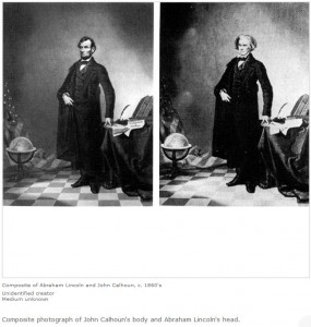 Lincoln Composite…and isn’t that Ironic: “Early in his career, Southern politician John Calhoun was a strong supporter of slavery. So it is ironic that an iconic portrait of Abraham Lincoln (circa 1860) is a photographic composite of Calhoun’s body and Lincoln’s head, purportedly created because no sufficiently heroic-style portrait of Lincoln had yet been taken. Perhaps what is most remarkable about this composite is that it was created only a few decades after Joseph Nicéphore Niépce created the first permanent photograph in the summer of 1826. Although we may have the impression that photographic tampering is something relatively new—a product of the digital age—the reality is that history is riddled with photographic fakes. Famed civil war photographer Mathew Brady routinely doctored photographs to create more dramatic images.”
I’m also reminded of Magritte’s painting of a pipe with the words” Ceci nést pas une pipe” — and, of course, it isn’t a pipe but rather an image of a pipe…
Ken, you got that right for sure 🙂